Role: Concepts, Style Guide, Designs, Graphics, UI/UX, HTML, CSS, SASS
Project Goal
After we updated MedSurvey’s survey experience to work on mobile, desktop and tablet, we knew we needed to update the main website to be responsive. Much like the user’s survey experience, we needed to take a mobile first approach to redesigning the website.
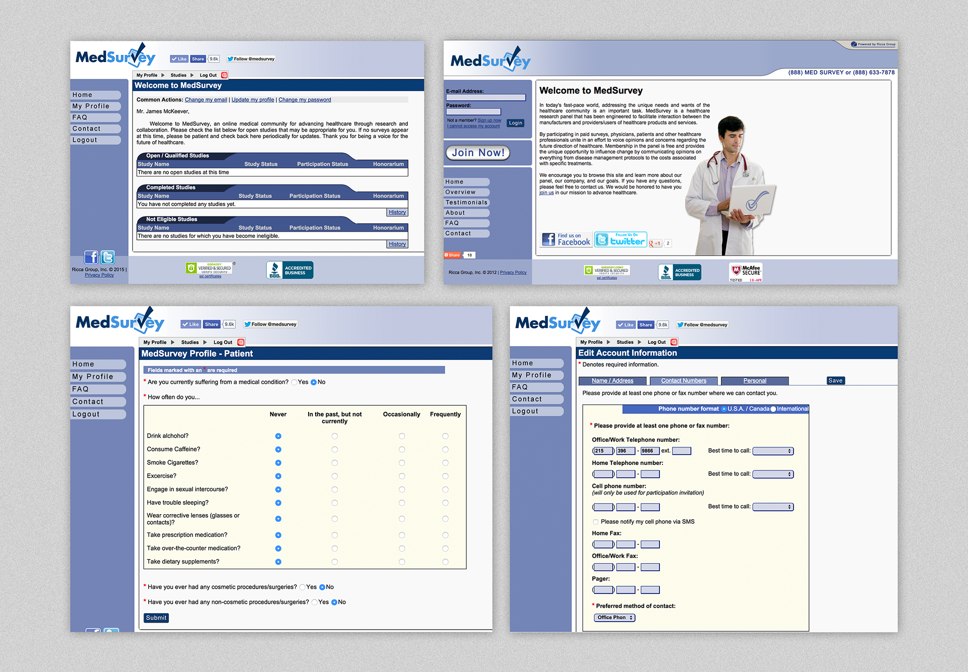
Old MedSurvey website and portal.
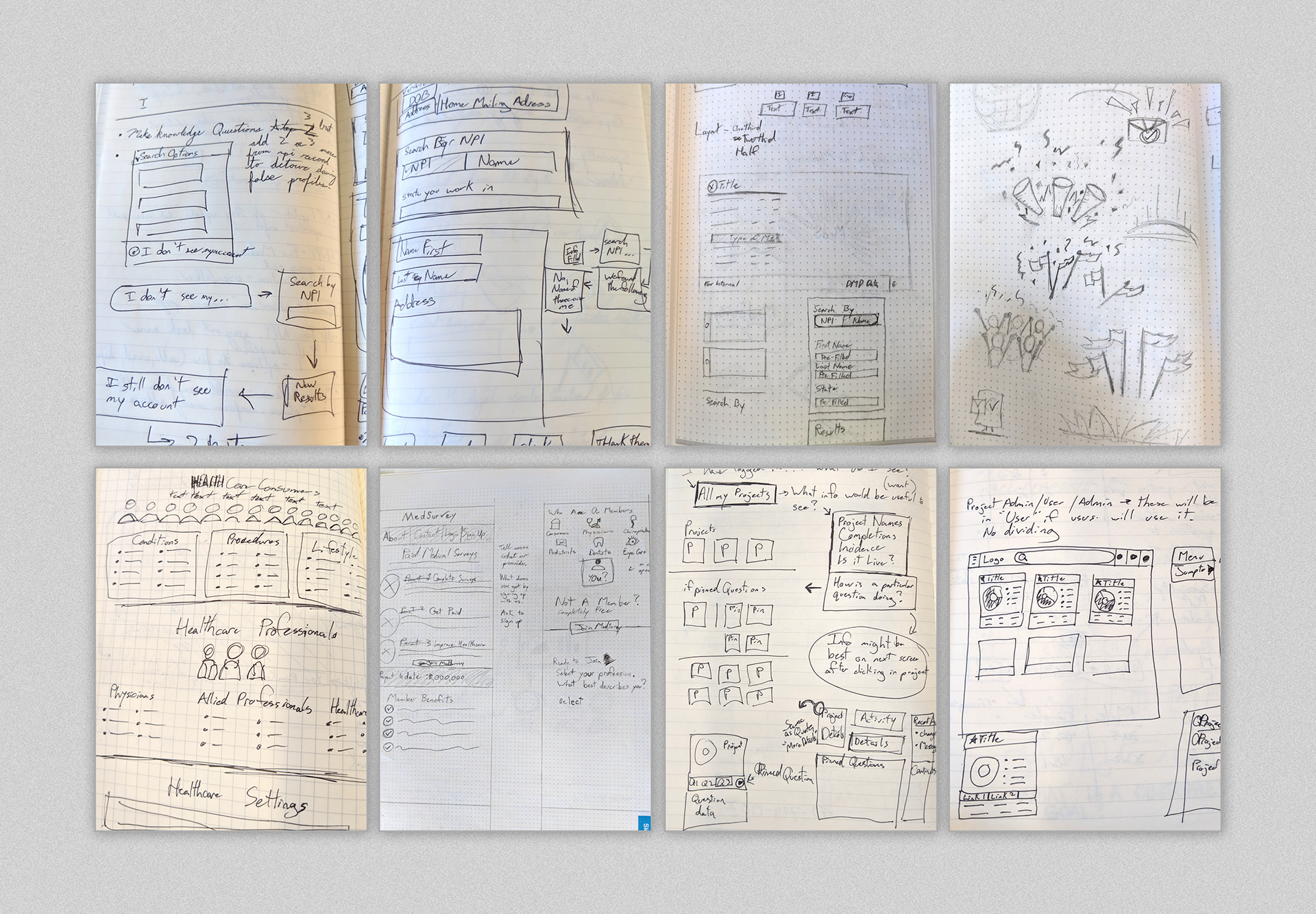
Sketches exploring sign up process, external and internal portal
Project Challenges
The biggest challenge in creating a community portal for medical market research is in the sign-up process. We quickly became aware that a workflow to verify medical professionals from patients was necessary.
If you were a patient signing up, that is pretty straightforward and minimal process, but you can’t just let anyone sign up saying they are a primary physician. You need to be sure they are medical professionals. We put a lot of thought into how to verify & identify if the user signing up was related to the medical field.

Wireframe - Exploring the steps required for signing up
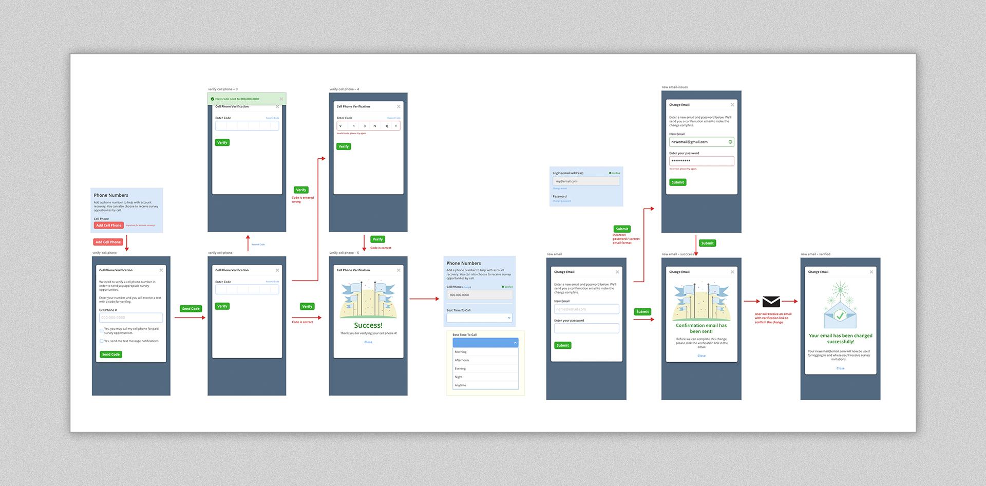
Wireframes (cont.) - actions for verify phone number, change email

Sample of graphics used throughout MedSurvey Community site and portal.
For the portal, we implemented a ‘card’ approach to relay which survey was available. From the user perspective, we identified the main factors a user would be incentivized towards a survey. Using this information, each card displays information such as survey format, length of time to complete, and potential earnings.
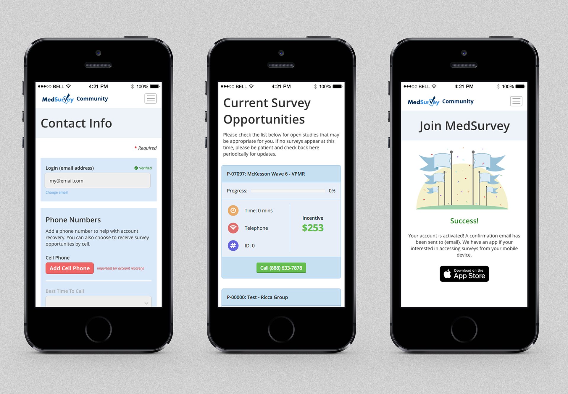
Example of MedSurvey Community portal on mobile.
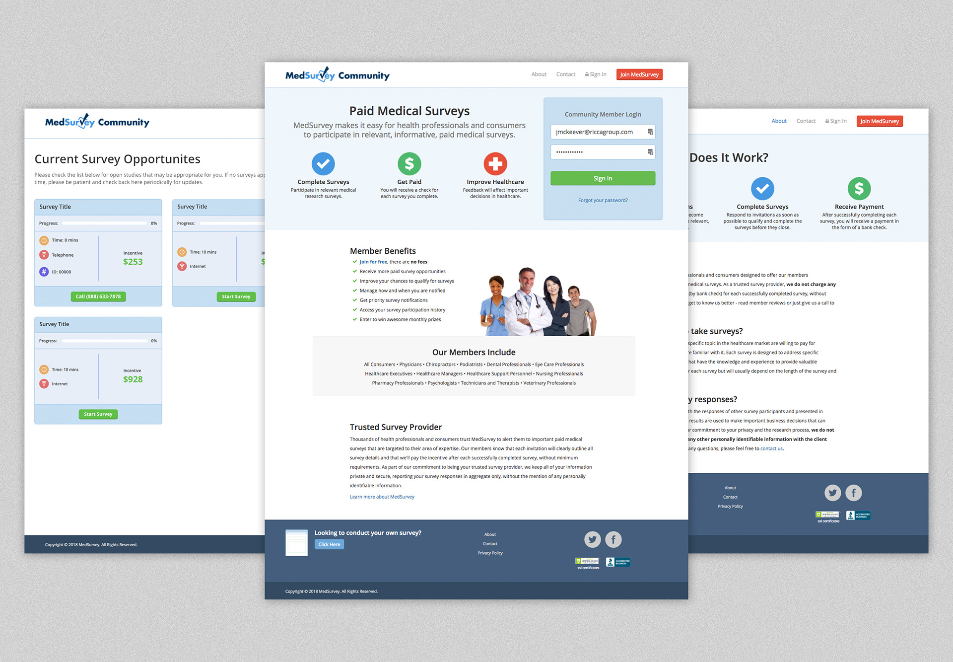
Screens of the MedSurvey Community website
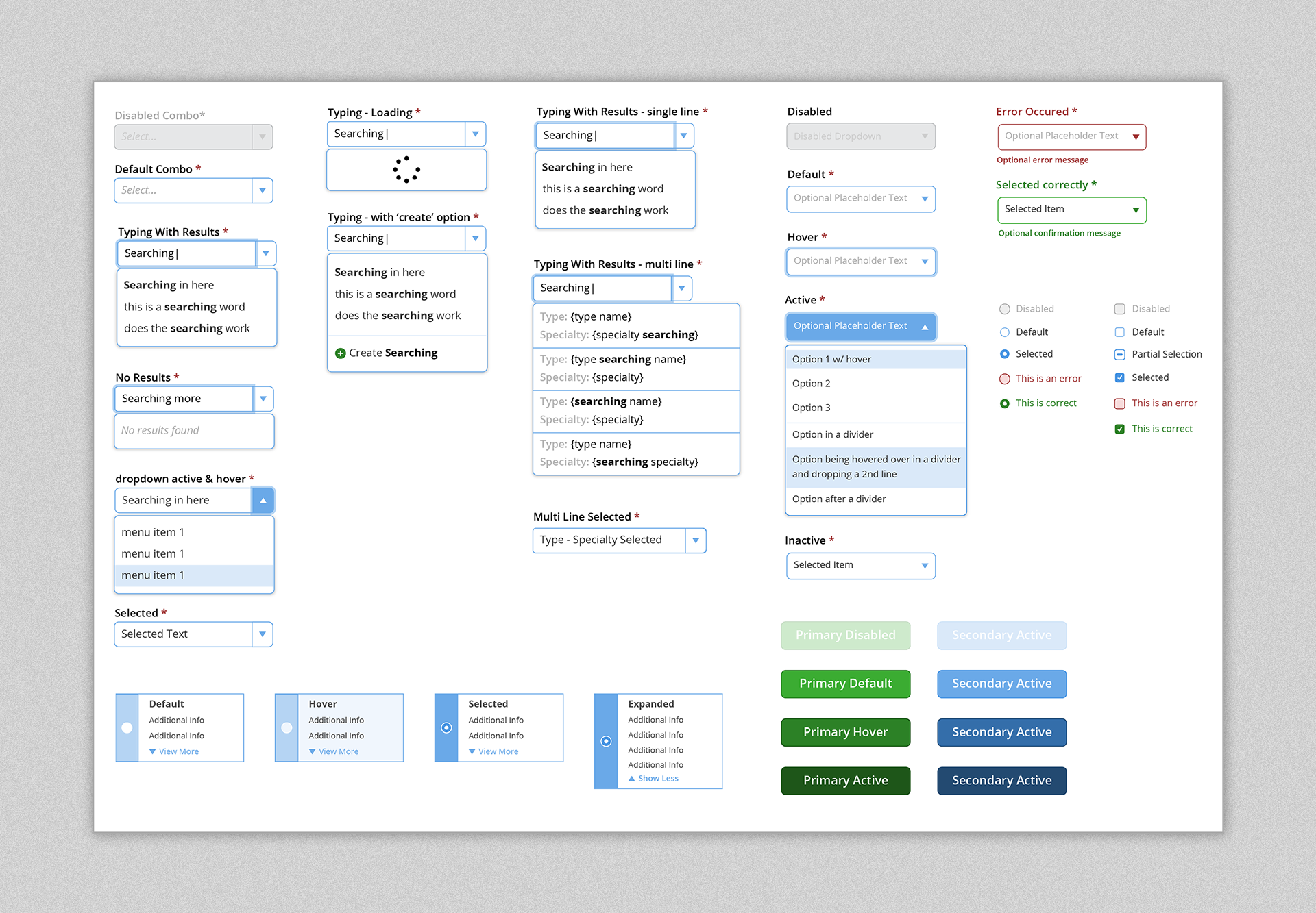
Sample of components from the style guide.
Conclusion
The alignment between the main website, survey app, and the User Interface positively impacted the User Experience. The graphics were fun to create, I handled much of the html and css that would be handed off to our developers along with the style guide, and the mobile experience in browser or mobile app felt similar no matter which you used. Now the survey taking experience and community website feel uniformed.