Role: Concepts, Designs, Graphics, UI/UX, HTML, CSS, SASS
Project Goal
I was tasked with the redesign of Ricca Group's survey website with a mobile-first approach for a quick and efficient experience for users. Then any user could take a survey comfortably at anytime on any device that was convenient for them. The idea was we would have more potential users since they would no longer be tethered to taking a survey on just a desktop computer. We wanted users to feel they could answer a question quickly, efficiently and be able to go on to the next question.
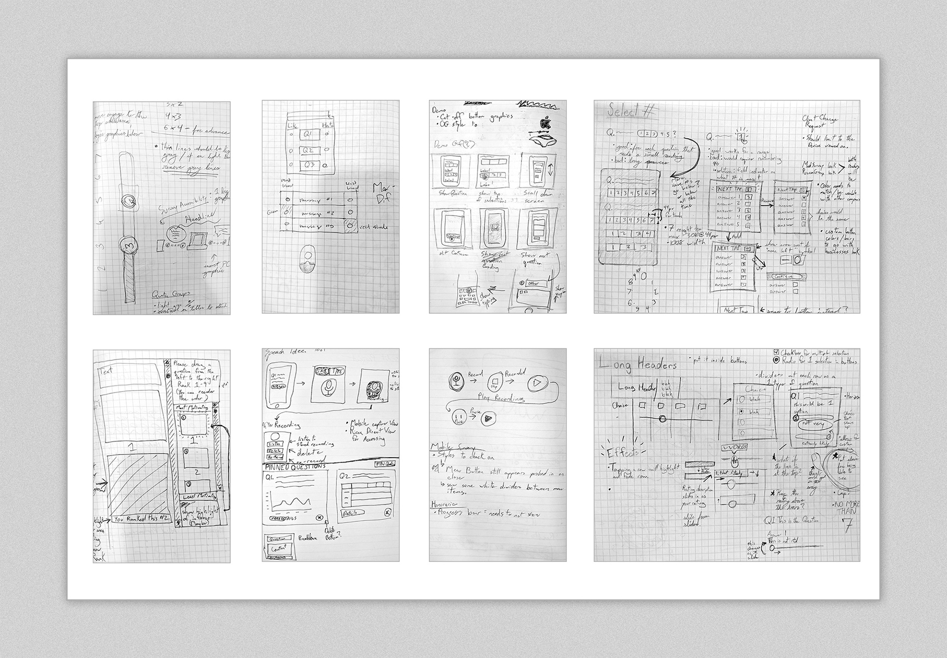
Sketches exploring survey questions and possible mobile solutions
Project Challenges
The difference between desktop and mobile in terms of user experience became apparent, and was a challenge that the team and I always strived to solve with a clean, easy to use UI that worked best in each ecosystem.
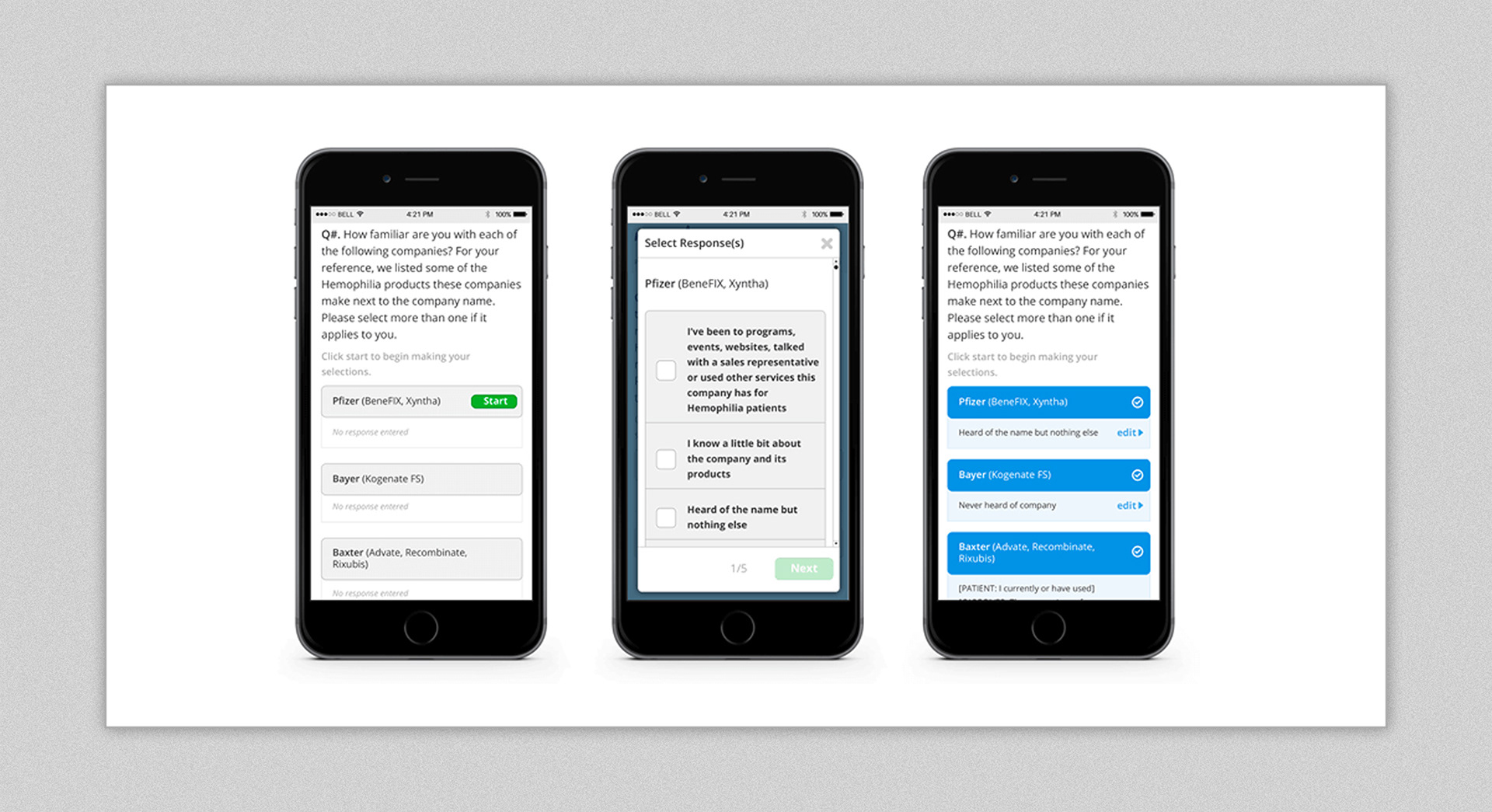
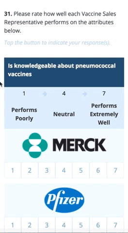
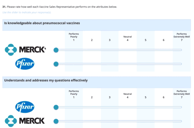
Not all survey styles translate well to the mobile experience - namely rating questions. The team and I solved this by implementing ratings sliders on desktop and using multi-tap on mobile.

Left: Old non-mobile survey design. Right: Mobile first approach to new survey designs.
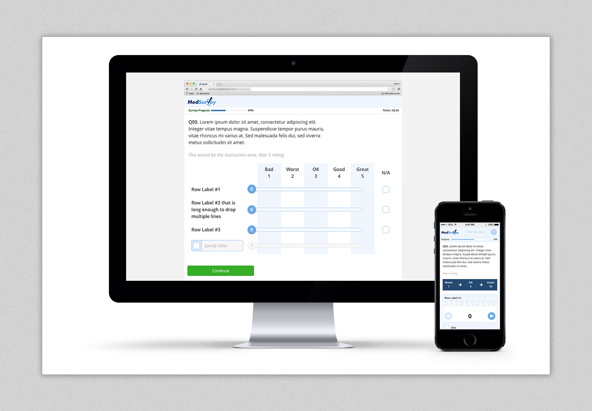
Enlarged rating slider on desktop and its tap version on mobile.
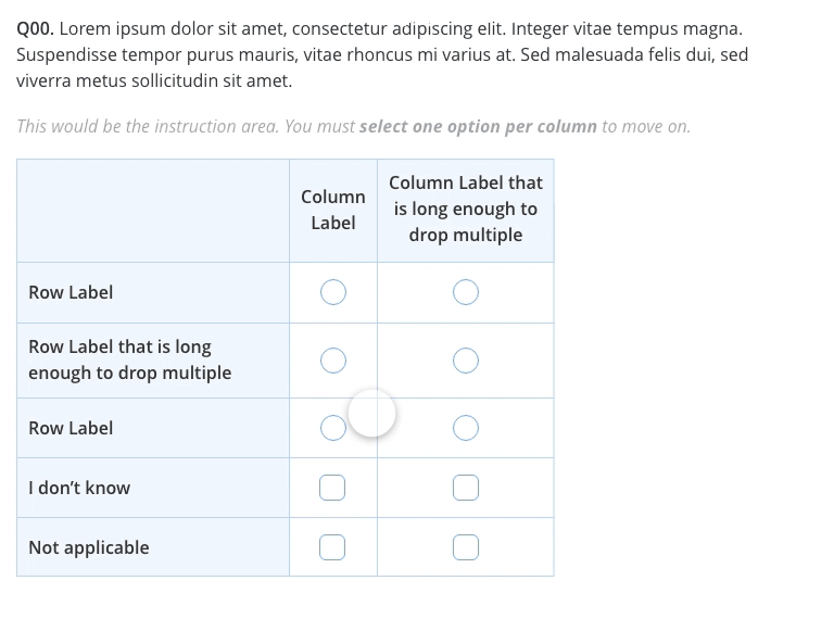
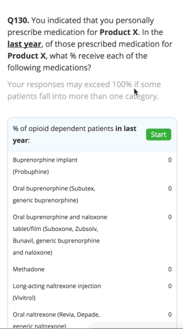
Oftentimes, survey questions included a grid format that were visually overwhelming on mobile. The team and I decided to break each portion of these questions into an overview with tiered selection to give greater clarity and focus to each question of the survey.
Mobile grid/table survey exploration
Video showing Grid / Table of font and column responsiveness
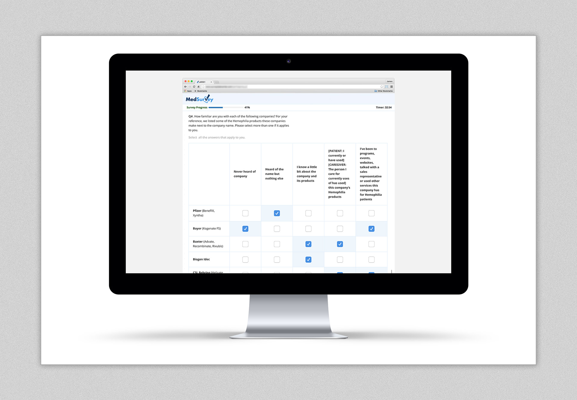
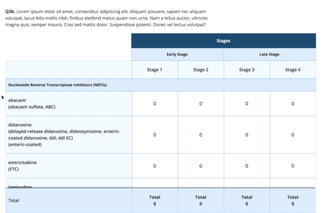
Grid-based survey on desktop
Grid-based survey in mobile
A client requested a voice recording application inside the survey to gain greater insight to the user's mood and/or confusion. A design was conceptualized.

Mobile voice recorder concept
Notifying the user that a question was left unanswered was visually displayed via a notification header and by highlighting the area.
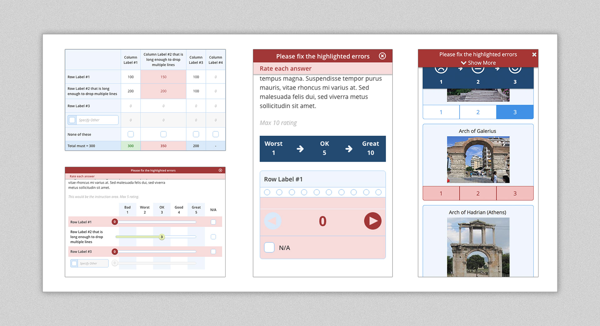
Validation notifications on desktop and mobile.
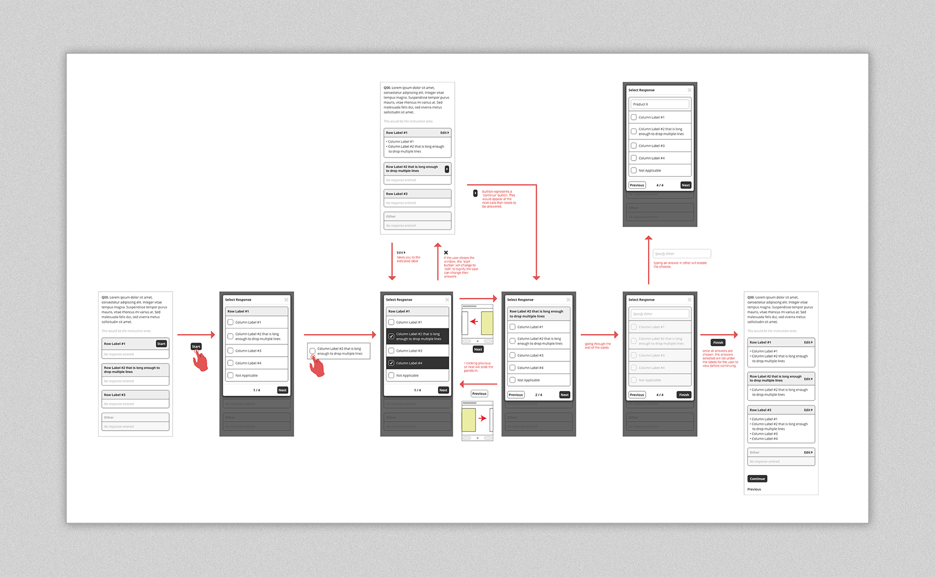
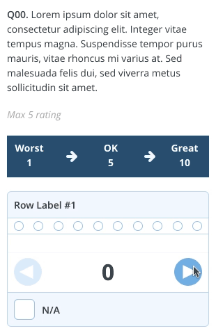
Many question types had to be figured out. What worked on desktop would not necessarily work on mobile when it comes to the user experience. Below are just some of the concepts of what a user should experience as far as look & feel for desktop and mobile.
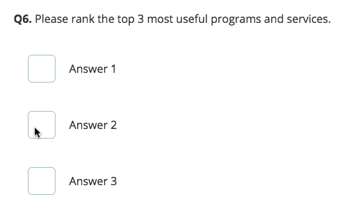
Rank in order on desktop and mobile
Disable columns in grid on desktop
Grid based question on mobile
sticky header and footer on desktop
Sticky headers on mobile
sticky headers on desktop
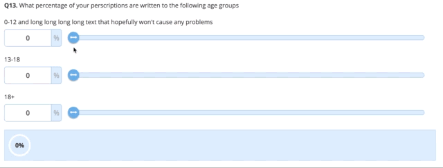
Sliders equal 100% on desktop
Tap to rank on mobile
Conclusion
This project is one of the ones I’m most proud of or many reasons. It pushed me to become a better designer for varying environments, to focus on not just the visuals for the user, but how the user will interact with each menu every step of the way, and work very closely with the development team to ensure the best UI was implemented.