Role: Concepts, Designs, Graphics, UI/UX, HTML, CSS
Project Goal
We knew we needed to make several changes throughout the website to bring it inline with the modern web. One, start with a mobile first approach and build up. The new design needed to read well on the smallest screen to the largest display. Two, trim down the marketing messaging. The old website had paragraphs of text that the average person would probably just skim (not read). We needed the new messaging to be short enough and clear to convey its meaning to users. Three, use illustrative icons and graphics to appear different from the competition which was using a lot of the same stock photos you would find on the first page of any photo library. Some stock photos would still need to be used, but we wanted to try and stay away from looking like everyone else by just using the same imagery.
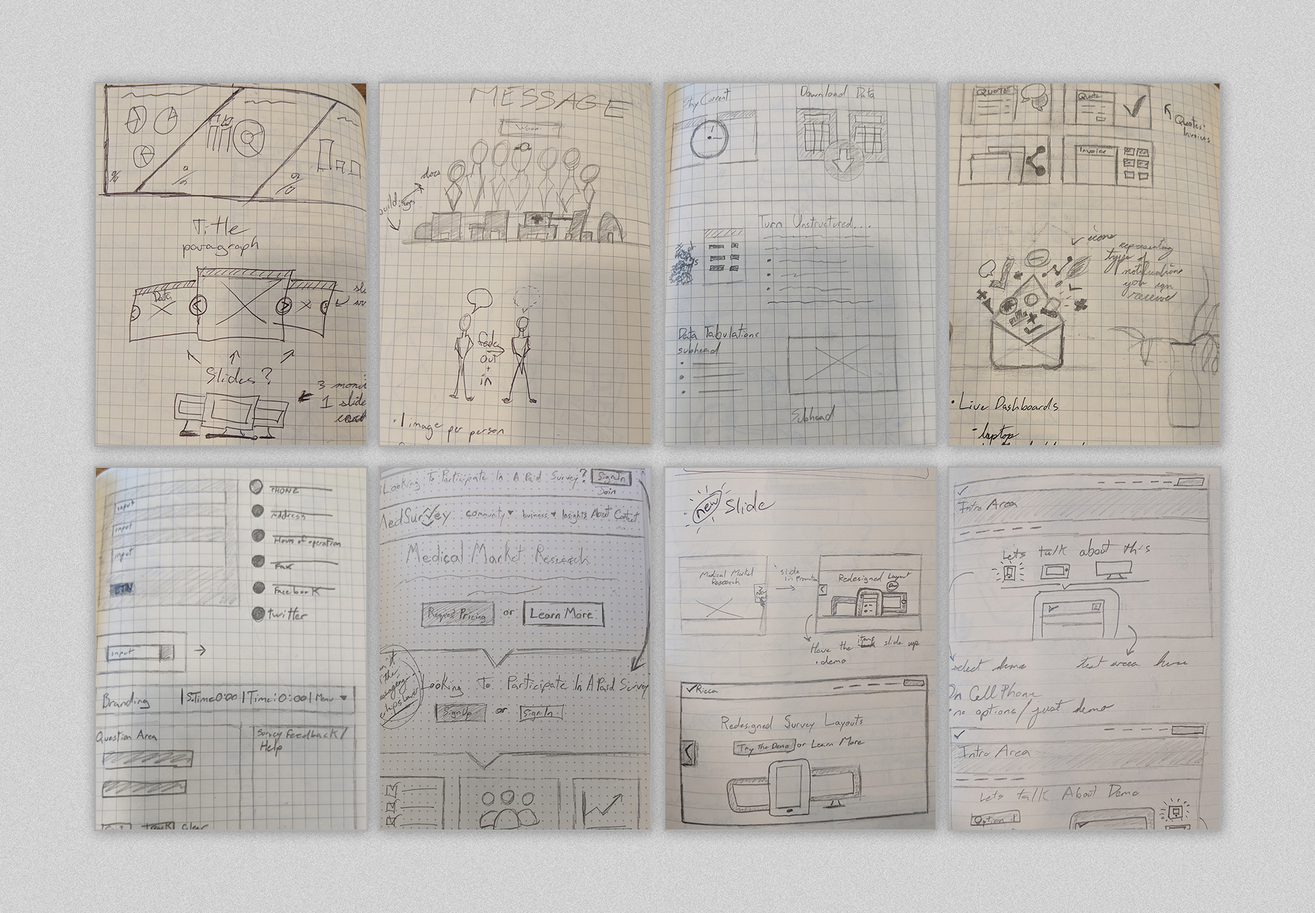
Sketches exploring layout, images, graphics
Mood board concept that ended up being the closest look & feel we went with.
Early digital creations of the website using photoshop and illustrator
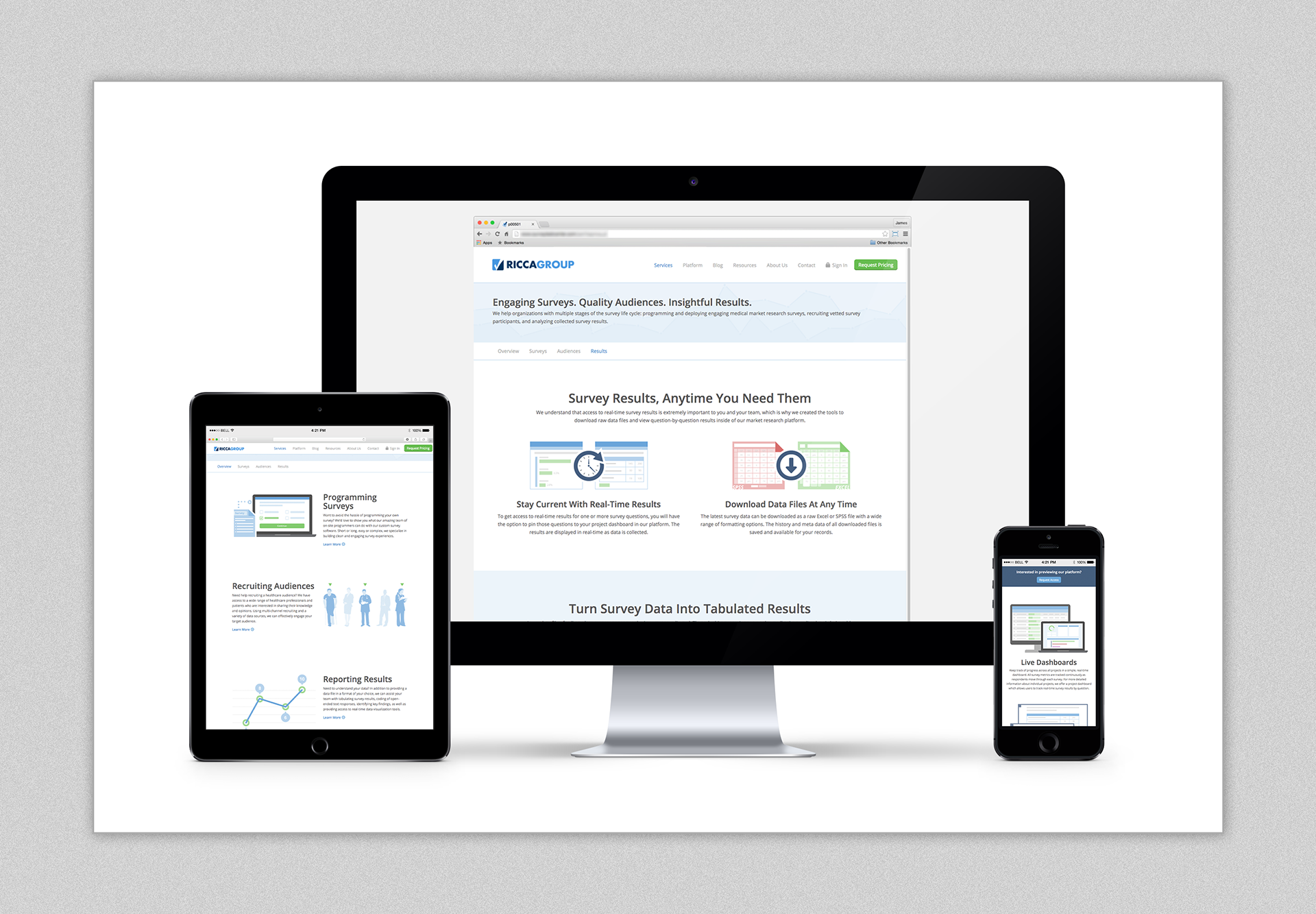
Final look of website design
Project Challenges
Redesigning any website has its challenges. You have to think of the user base that constantly returns to the website for information or to login. You have to think about getting new traffic to your website whether its by googling, a promotion page, ads, etc. The old website had paragraphs of content that we needed to trim down. Refocus the messaging to be shorter and clearer to new visitors. Our analytics showed us that most new visitors were either logging in, seeing what services we offered or contact us. Most of the other pages were ignored or not browsed by many. We wanted to make sure the current popular pages were easy to read and properly updated such as adding an interactive demo to our services page.
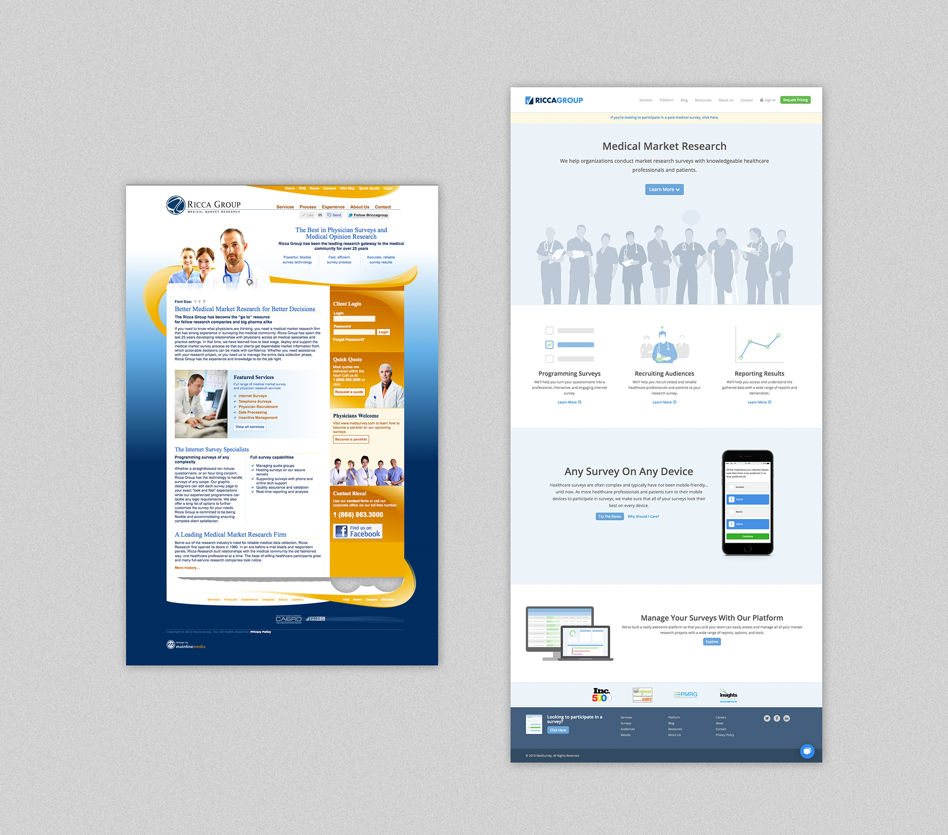
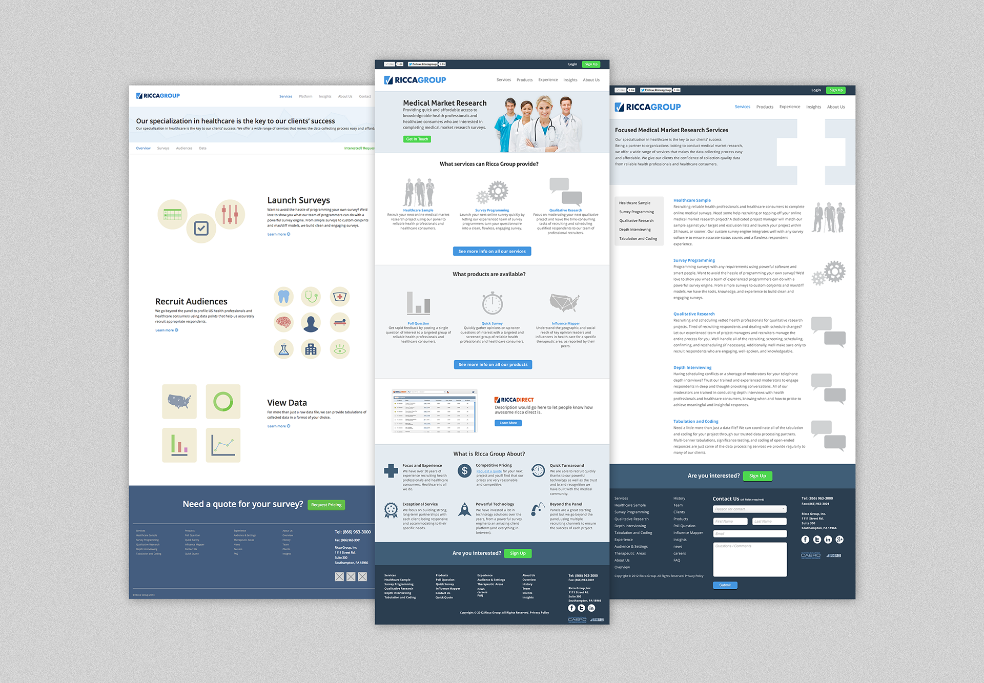
Comparing - Left: Old Ricca Group Website | Right: New Ricca Group Website
On a technology / software side, we're a small team and needed to use something that was already heavily documented, had responsive capabilities and easy to dive in. We used wordpress and bootstrap for handling the layout and managing the pages.

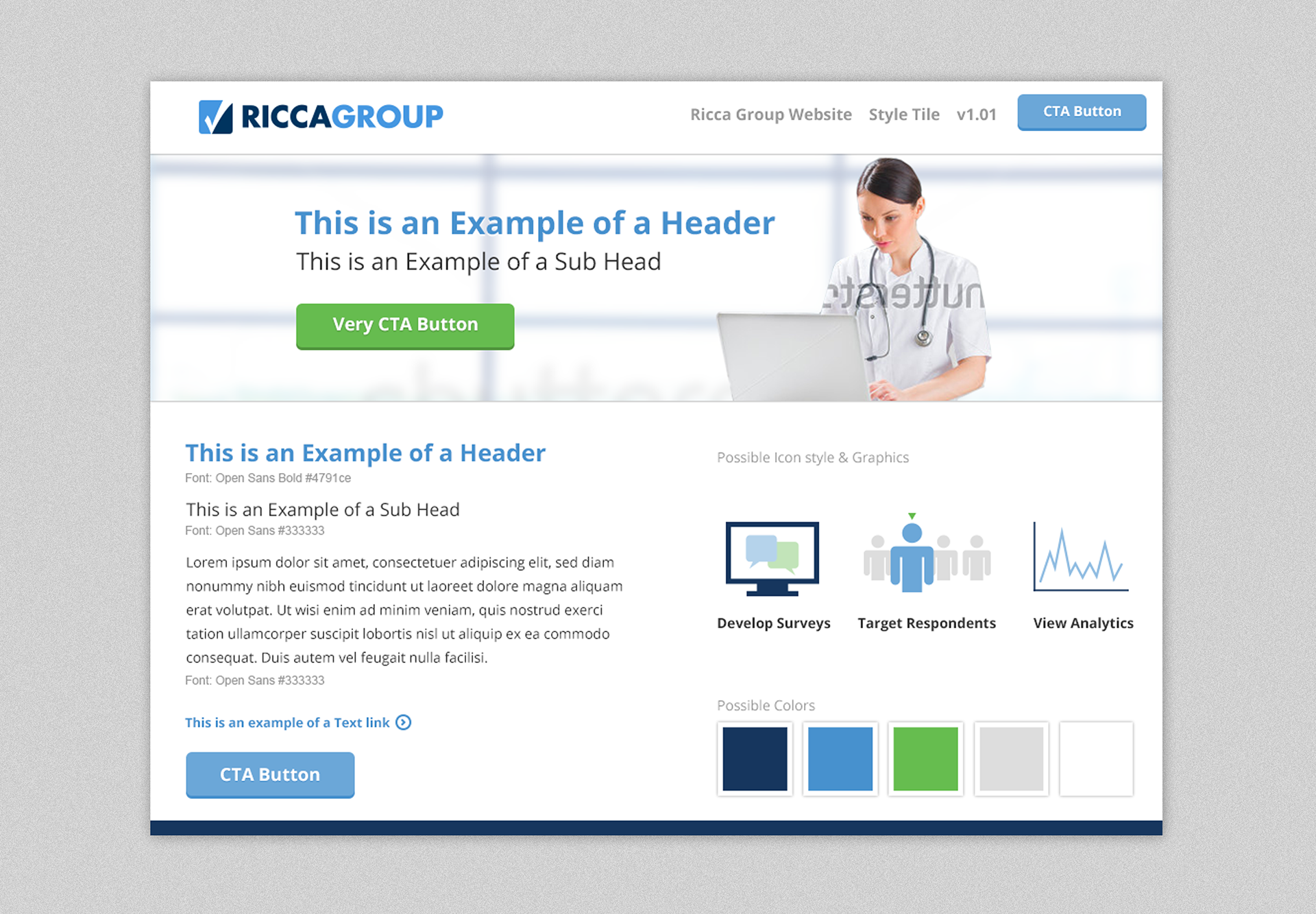
A sample of the style guide
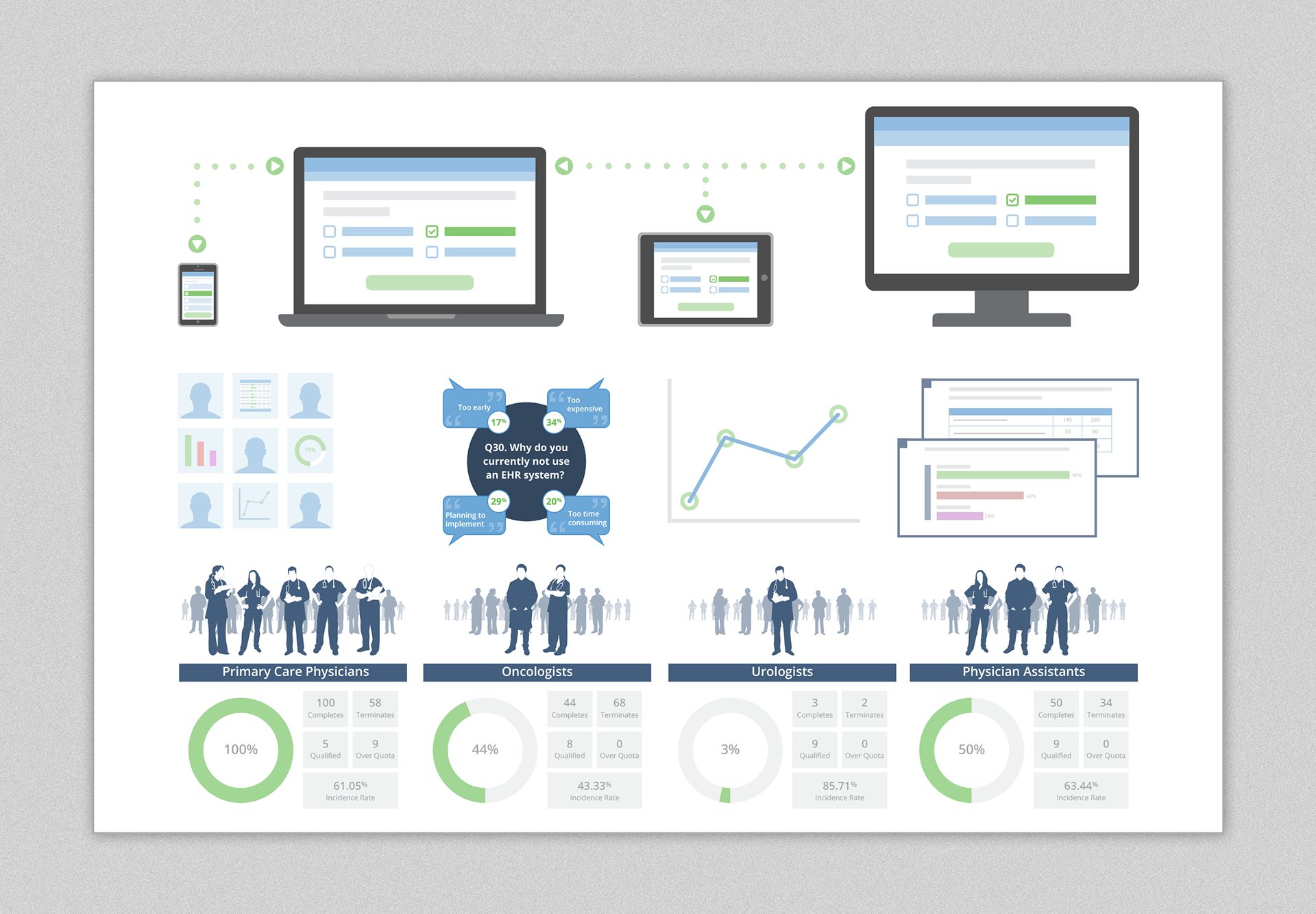
Sample of graphics I created throughout riccagroup.com

(Cont.) Sample of graphics I created throughout riccagroup.com
Conclusion
The updated website came together nicely. Using illustrated icons and graphics gave our website and brand a different feel from other competitors. The messaging was shorter and tighter, navigation is clearer, and the page layouts are easy to browse on different screen resolutions. If there's one area of improvement that could use an update, the 'people' graphics could be improved upon, but otherwise the overall feel of the website is pleasant and easy to digest.