The OoTR website takes The Legend of Zelda: Ocarina of Time and randomizes the locations of items in-game to create a more dynamic play experience. I was tasked with improving the overall look of the website and the first-time experience of new players who stumble across the website and ask, “what’s this about?”
Role: Website designs and page/content layout, build front-end using HTML, Tailwind CSS, and JavaScript/jQuery for interactions, create new community logo.
How did I end up working on this project?
I saw a post from one of the maintainers of the website saying they were working on updates and planned on giving the site a fresh look that was friendlier to first-time users, along with plans to make it work better on mobile devices. I thought to myself, I’m a designer and I enjoyed playing this randomizer during covid-times, maybe I could give back to the community?
I started with new logo concepts, as well as a new overall website design. I made notes of what I struggled with as a new user, and made examples of potential improvements. Sent it off to the developers and waited to hear back. They did get back to me, and we began working together to craft a new website.
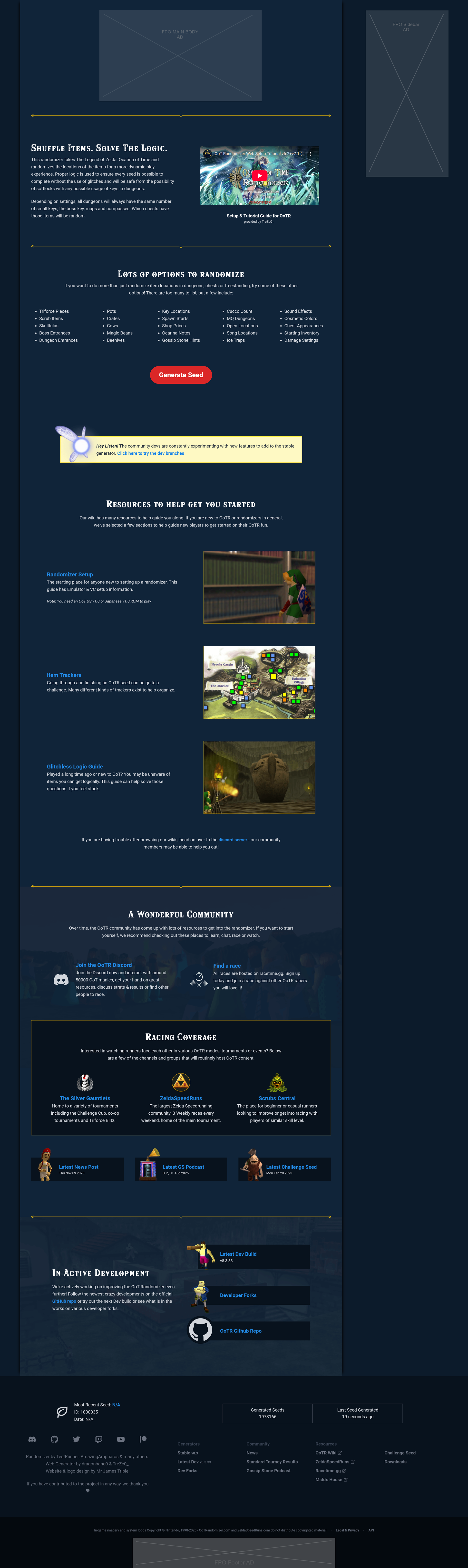
Below is what the website looked like in its current state at the time.
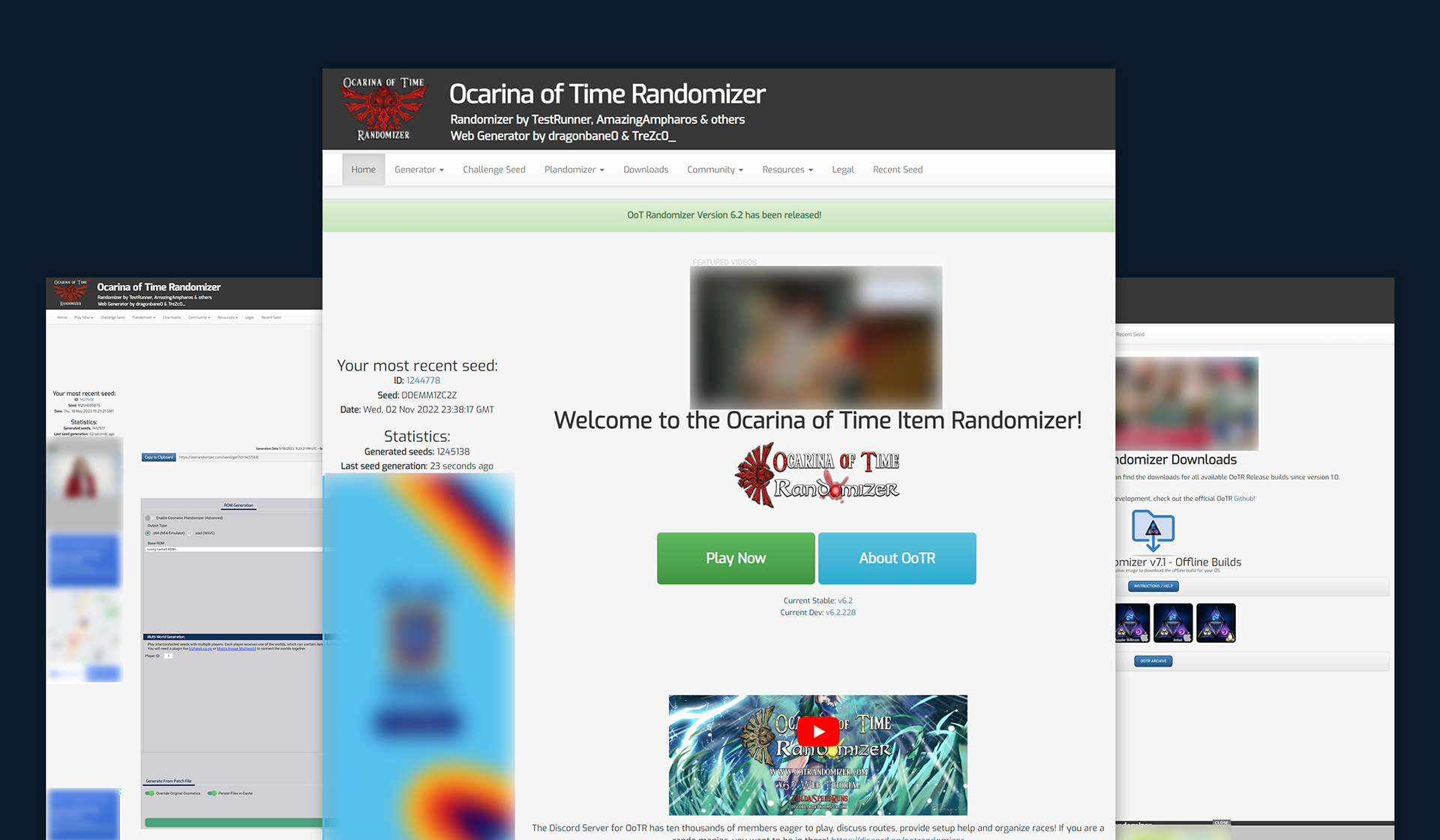
Old Website look & feel (blurring out ads because... well, you know)
What areas needed addressing:
- Make the site look less spammy upon first impression
- Improve hierarchy of information and actions
- Update content to better explain the tool and who it is for
Improve mobile experience
- Improve hierarchy of information and actions
- Update content to better explain the tool and who it is for
Improve mobile experience
Below are examples of screens I sent over along with my pitch.
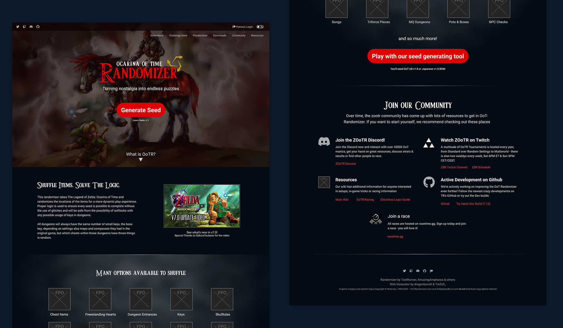
Concepts I sent along with my original pitch to the devs.
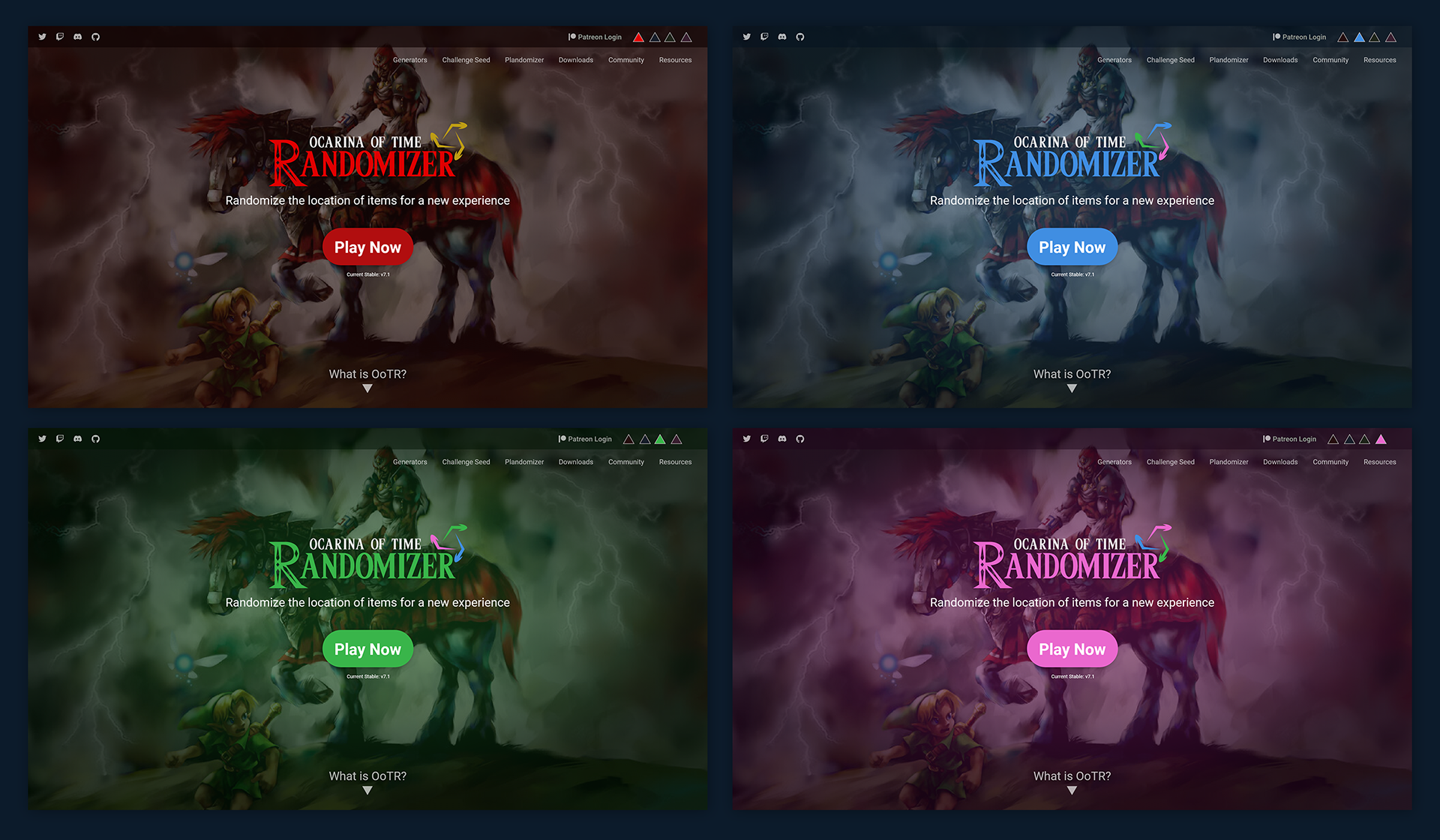
Potential color options look & feel. Early idea of having a palette swap.
After some conversations with the developers, we knew it had to be easy to update and maintain, preferably using an existing framework with well supported documentation. This was a community project after all and needed to be as easy as possible to maintain.
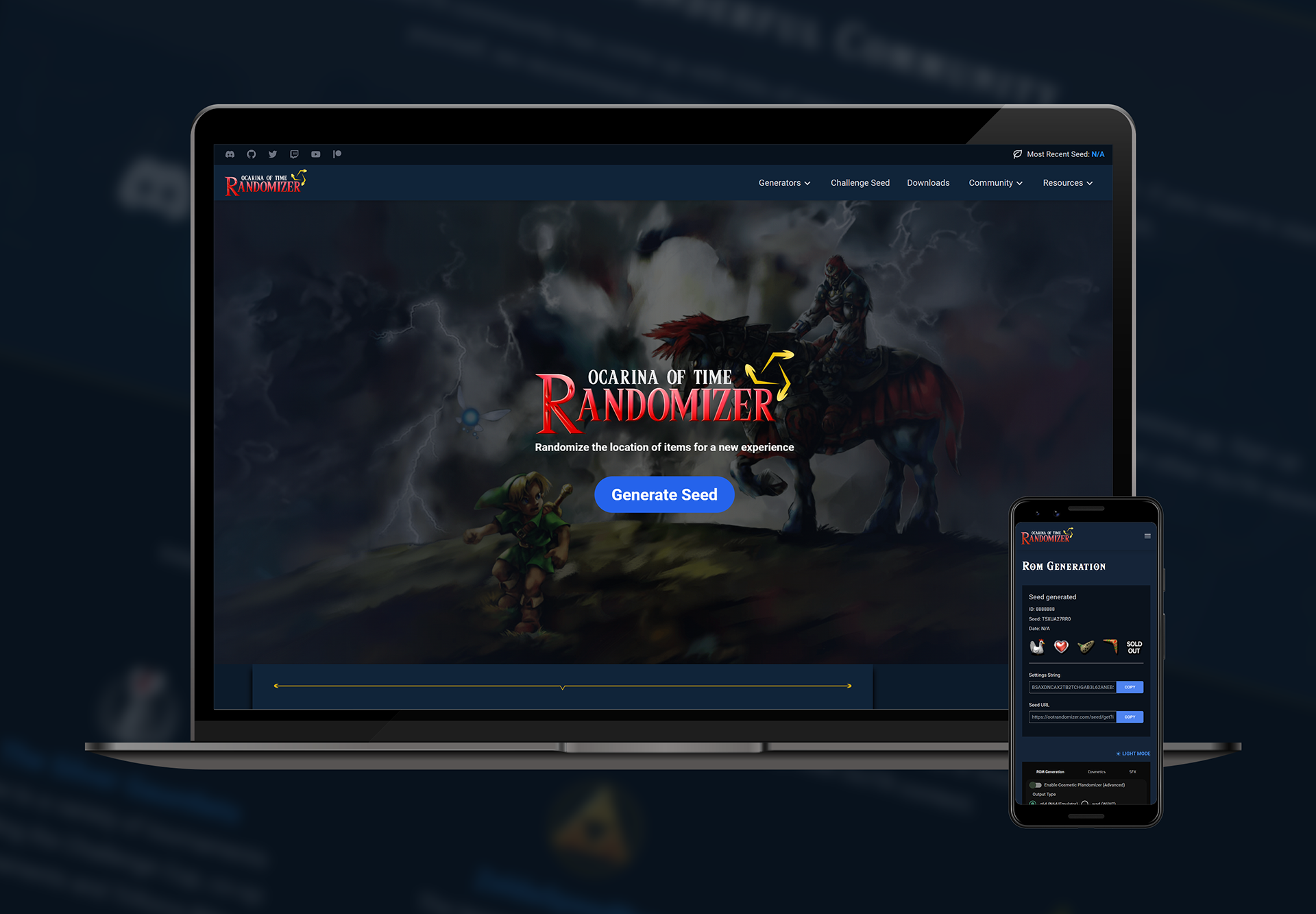
Full Home Page with placeholders for ad space
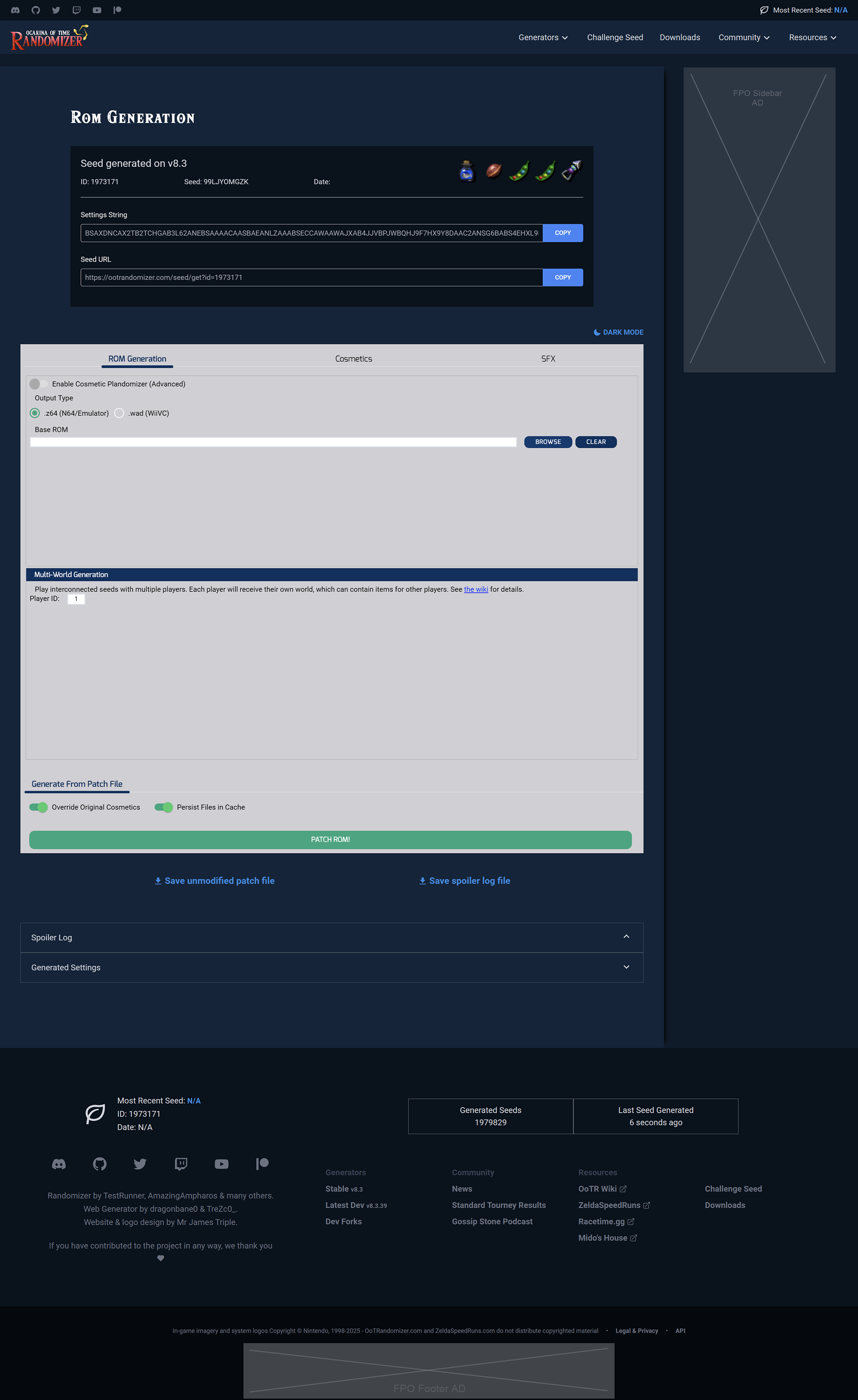
Rom Generation Page
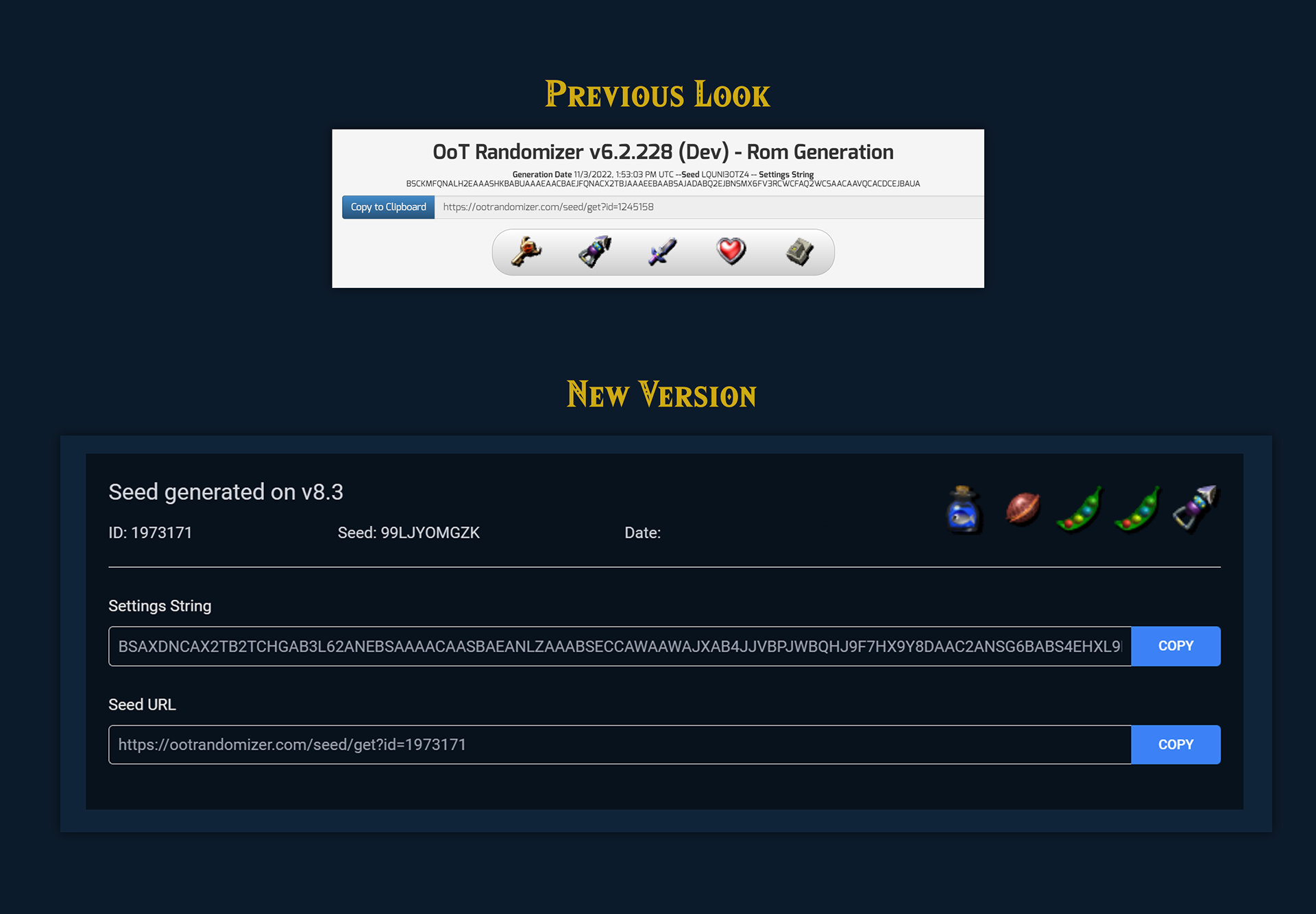
Old layout of Seed Generation details and information compared to new layout
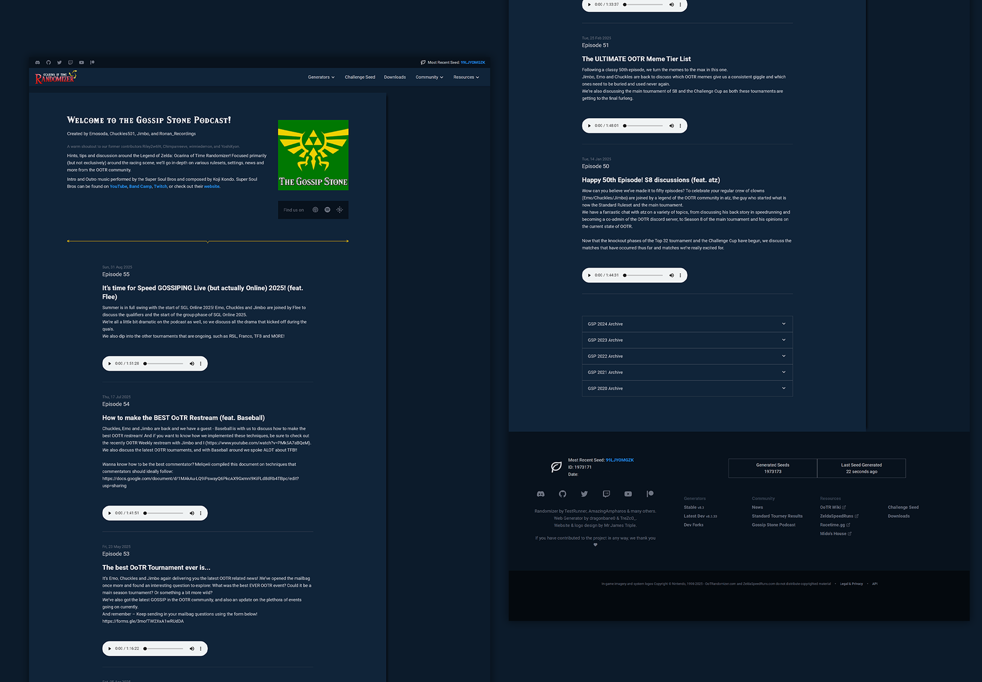
Example of one of the community pages
Were there any challenges?
Ads. The old website had ads. The new website was going to have ads. Ads are a non-negotiable fact for many community-driven projects as they provide some revenue for hosting. I did my best with the new site layout to place them in areas that still met the goals of the project but would hopefully be less intrusive in a user's browsing experience.
Another main challenge to address was the actual Rom Generation page. If a user gets stuck in a run finding a particular item, they need a place to search. The old spoiler log was OK, but we knew we could give it a better layout, add a way to search and improve the category breakdown.
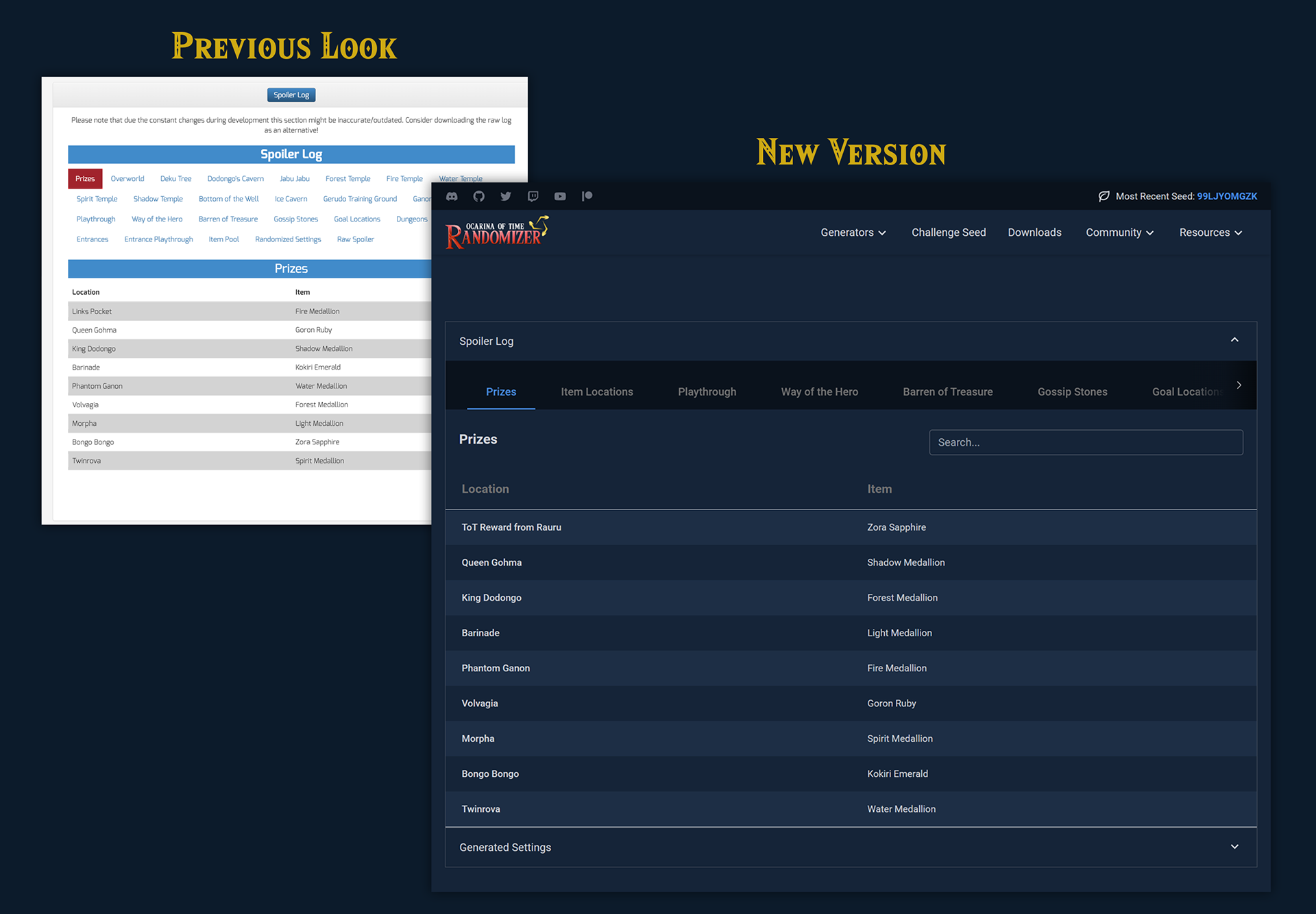
Old layout of Spoiler log compared to new layout
Example of website being used on mobile device
Updated Logo
With a new website comes an updated logo.
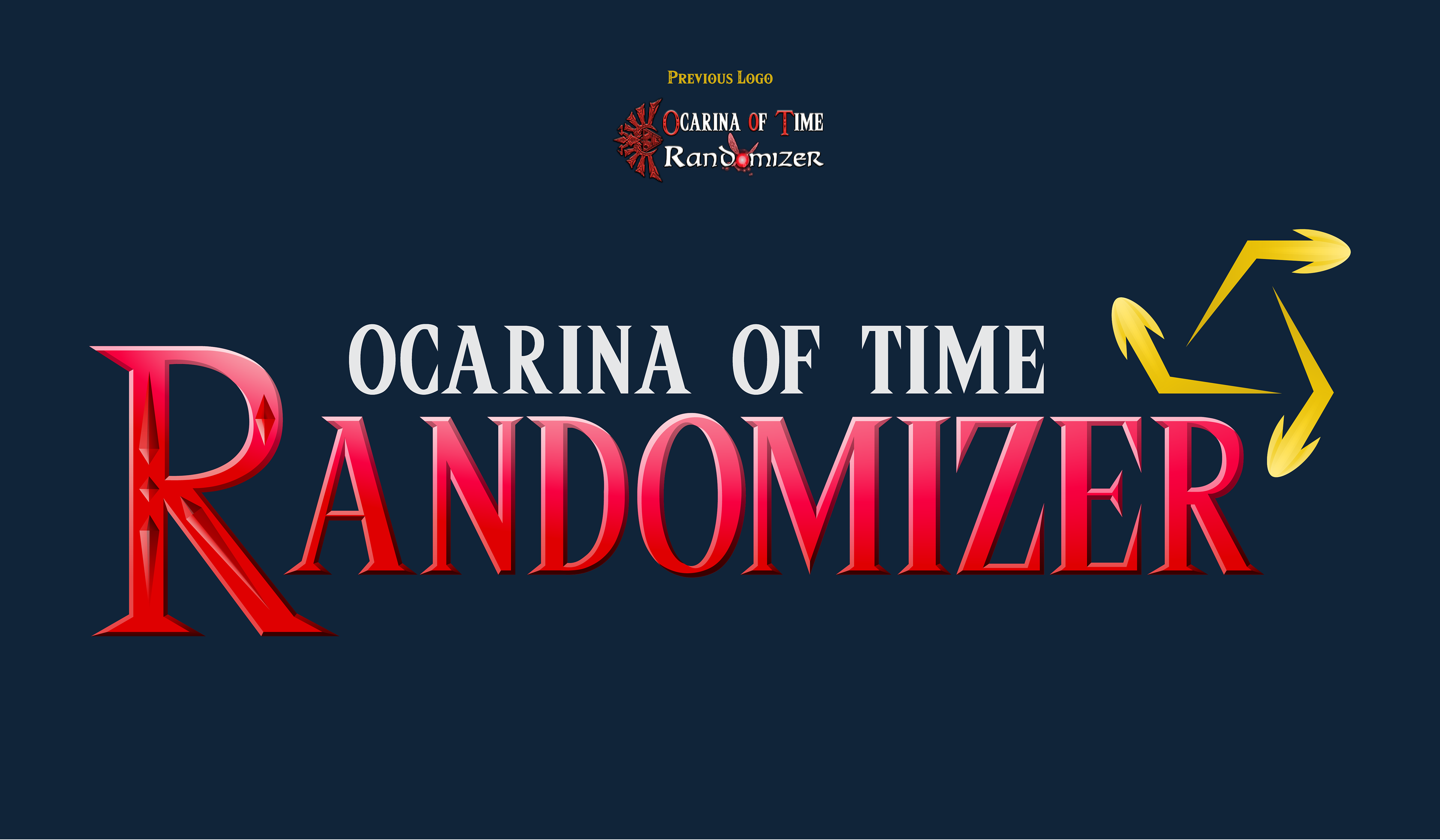
Old logo and New Logo
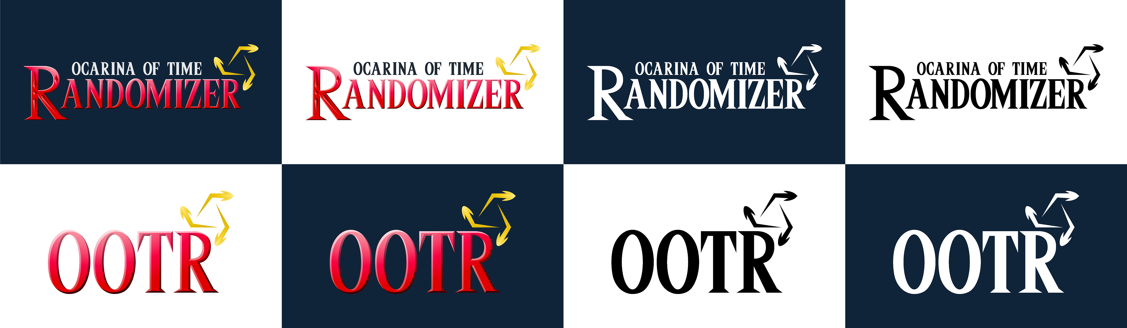
Full & Short Logo treatment on light & dark backgrounds
What issues were found in testing?
We knew we wanted to update & improve upon the old spoiler log. It tested well when we were in pre-production, but when the update went live, the main feedback we received was with the way you navigated the spoiler log. Several users did not like that they couldn’t see each category at a glance on desktop like they were accustomed to, they didn’t like clicking the arrows to go left or right to view the categories. It seemed to be a pain point for legacy users.
Version 1 of the Spoiler Log
For a cleaner look and clearer relationship between tabs and table content, I kept the navigation to one line to accommodate most mobile, tablet and desktop screen sizes. I am not a fan of stacking tabs for displaying content; but early testing showed this was a possible solution.
As more users were using the live website with the updated spoiler log, requests to change the interactions or display came up. For a solution, on desktop-size screens, we changed it back to the stacked tab look. We adjusted the space and size of the tab labels on desktop-size screens so it wouldn’t create multiple rows of stacked tabs like the old version did. We did keep the horizontal look for mobile-size screens.
Version 2, the final look we went with for desktop.
Closing Thoughts
I am grateful for having the opportunity to give back to the OoTR community. This was a pleasure to work on, I learned another framework, and I got surprising test results. I would like to give a big thank you to the maintainers of the randomizer and the OoTR speedrunning community at large.